
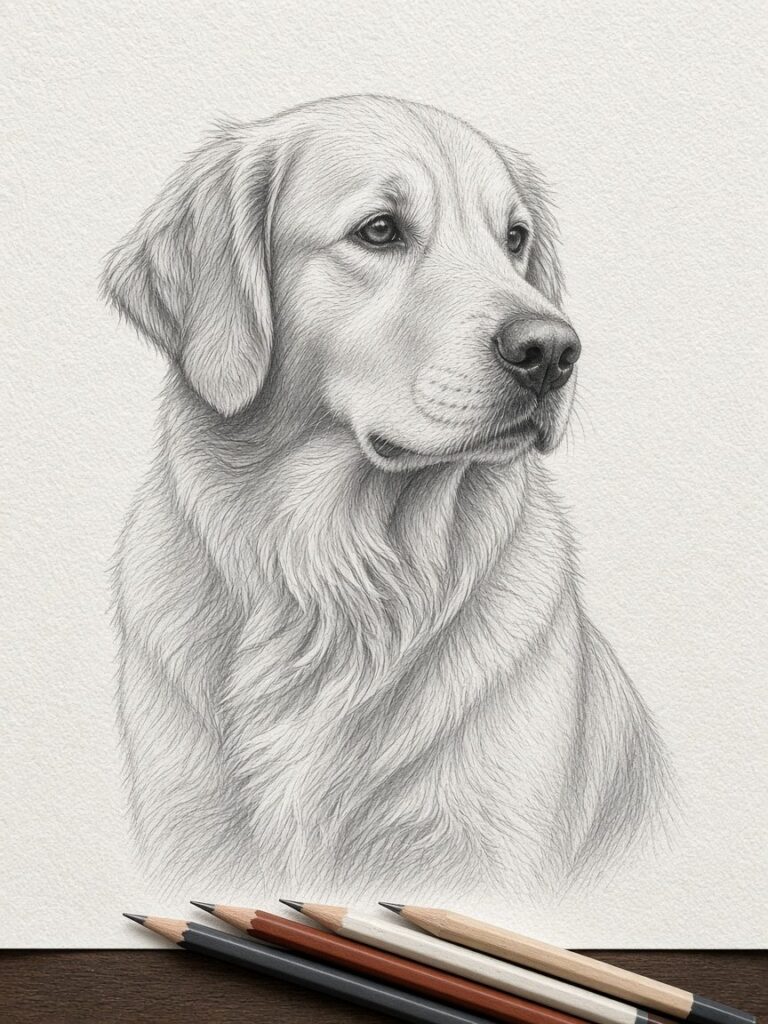
If you have ever looked at a box of drawing pencils, you have seen the little codes stamped on the side: 4H, 2H, HB, 2B, 6B, sometimes 9B. To most people they look like a filing system. To a portrait artist they are the whole palette. A graphite portrait has no colour, so every bit of depth, softness and contrast in the drawing comes from choosing the right pencil for each part of the image. Here is what those codes mean and why they matter for a portrait of your pet or your family.
What the letters stand for
Pencil “lead” is not lead at all. It is a mix of graphite and clay, baked into a thin rod. The more clay in the mix, the harder the core and the lighter the mark. The more graphite, the softer the core and the darker the mark.
- H stands for hard. H pencils leave light, crisp, grey lines and keep a sharp point for a long time.
- B stands for black (some say bold). B pencils are soft and leave rich, dark marks that blend easily.
- HB sits in the middle: hard and black. It is close to an ordinary writing pencil.
- F means fine. It sits between HB and H and is useful for neat, light detail.
The number tells you how far along the scale you are. A 6H is much harder and lighter than a 2H. An 8B is much softer and darker than a 2B. Different brands are not perfectly consistent, so one maker’s 4B can be close to another’s 3B, which is why artists tend to stick with sets they know well.
Why one pencil isn’t enough
You could, in theory, draw a whole portrait with an HB by pressing harder for darker areas. In practice it looks flat. Pressing hard with a hard pencil polishes the paper and leaves a shiny, grey mark that never becomes a true black. Pressing lightly with a very soft pencil leaves a grainy, uneven tone. Good portraits use many grades so that each tone is made the easy way: light tones with harder pencils, dark tones with softer ones.
There is also the matter of layering. Paper has a “tooth”, a fine texture of tiny hills and valleys. Each layer of graphite fills a bit more of that tooth. Artists usually lay down lighter, harder grades first and build up toward softer, darker grades. If you start with soft graphite, the tooth fills too fast and the paper stops accepting new layers, which makes it hard to adjust anything later.
How the grades are used in a typical portrait
Hard grades (4H to H): structure and the lightest tones
The first marks on the paper are usually made with a hard pencil. They are light enough to erase cleanly and show very little once the drawing is finished. Artists use them to map out the position of the eyes, the angle of the nose, the outline of the ears and the main shapes of shadow. Hard grades are also used for pale skin, white fur and soft background tones where a darker pencil would look heavy.
Middle grades (HB to 2B): midtones and detail
Most of the “body” of a portrait lives in the middle range. Skin tones on a face, the general colour of a tabby cat’s coat, the folds of a shirt: these are often built up with HB, B and 2B. These grades keep a point reasonably well, so they work for fine hair strokes too.
Soft grades (4B to 9B): deep shadows and the darkest darks
The darkest parts of a portrait, such as pupils, nostrils, the inside of a dog’s mouth, black fur or the shadow under a chin, need soft pencils. A soft grade gives a velvety black without polishing the paper. Because soft graphite smudges easily, artists usually save it for late in the drawing and work carefully around it.
Contrast is what makes it look real
When people say a pencil drawing “looks like a photo”, what they are usually reacting to is a full tonal range: very bright highlights right next to very deep darks. A drawing done mostly in middle grades tends to look washed out, however accurate the shapes are. The softer grades are what let the artist push the shadows far enough that the highlights pop.
The highlights themselves usually aren’t drawn at all. They are the white of the paper, either left untouched or lifted out with an eraser. A kneaded eraser can be shaped into a fine edge to pull a bright line through dark fur, or pressed gently to lighten an area. A precision eraser can lift out a pinpoint catchlight in an eye. So “pencil grades” really includes the eraser as a tool working in reverse.
Graphite powder, sticks and blending
Besides pencils, many portrait artists use graphite in other forms:
- Graphite powder, brushed on with a soft brush or a cotton pad, gives an even base tone across a large area such as a background or the shape of a face.
- Woodless graphite sticks cover large dark areas quickly.
- Blending stumps and tortillons (tightly rolled paper tools) smooth out pencil strokes for soft skin or a smooth nose.
Blending is a matter of taste. Some styles blend almost everything for a soft, photographic finish. Others leave visible strokes so the drawing clearly reads as hand-made. For fur, most artists blend the base layer and then draw individual hairs on top so the coat has both softness and texture.
What this means when you order a portrait
You don’t need to know any of this to commission a drawing, but it helps explain a few things:
- Why larger portraits cost more. Building up layers across a bigger sheet takes far more time, especially in the dark areas.
- Why a good photo matters. The artist matches the tones in your photo. If the shadows are muddy or the highlights are blown out, there is less information to build that full range of tones from.
- Why originals need protection. Soft graphite can smudge if something rubs against it. A mat and glass keep the surface safe.
- Why black pets are not “easier”. A black dog or cat still has many tones: blue-grey sheen, brown edges, bright highlights on the nose. Getting those right with dark grades is careful, slow work.
A quick reference
- 4H–2H: layout lines, very pale skin, white fur, light backgrounds.
- H–HB: early layers, gentle shading, fine detail lines.
- B–2B: midtones on faces and coats, hair strokes.
- 4B–6B: strong shadows, dark fur, eyebrows, hair.
- 8B–9B: the darkest accents: pupils, nostrils, deep creases.
The short version
The letters and numbers on a pencil describe how hard or soft the graphite is, and that controls how light or dark a mark can be. A realistic portrait is built in layers, from hard to soft, light to dark, with the brightest areas left as bare paper or lifted out with an eraser. When you look closely at a finished graphite portrait and see silvery fur next to deep black eyes, you are seeing a dozen different pencils working together.