When people think about a pencil portrait, they think about the pencils. But the paper does just as much work. It decides how dark the darks can go, how fine the details can be, how well the drawing survives erasing, and whether the sheet will still be white in fifty years. Here’s a guide to the main things that make drawing papers different, and what they mean for a commissioned portrait.
Surface texture: the “tooth”
Under a magnifying glass, paper looks like a landscape of tiny fibres, hills and valleys. Artists call this texture the tooth. When you draw, the pencil scrapes graphite off onto the tops of those fibres. More pressure and more layers push graphite down into the valleys.
Smooth (hot-pressed or plate finish)
Very little texture. Graphite sits evenly, giving smooth gradients and crisp detail. It’s excellent for photorealistic portraits, fine hair and whiskers, and skin tones. The downside is that smooth paper holds fewer layers before it becomes saturated and shiny, so the artist has to plan the darks carefully.
Medium (vellum or regular finish)
A light, even texture. It holds more layers than smooth paper and still allows good detail. Many portrait artists consider it the most versatile choice.
Rough or textured
Pronounced texture that shows through as a grainy pattern in the shading. This is good for expressive drawings and charcoal, less suited to fine, realistic graphite work, because the grain breaks up smooth tones.
Weight: how thick the paper is
Paper weight is given in grams per square metre (gsm) or in pounds (lb). Pound figures are confusing because they depend on the paper type and sheet size used for the measurement, so gsm is easier to compare.
- Printer paper is typically around 75–90 gsm: thin, flimsy, and easily damaged by erasing.
- Sketchbook paper is often around 100–150 gsm: fine for practice.
- Heavyweight drawing paper is roughly 180–300 gsm or more: stiff, durable, and able to handle many layers and repeated erasing without pilling or tearing.
For a commissioned portrait, a heavier paper matters. It stays flat in the frame, survives shipping better, and lets the artist lift highlights with an eraser without wearing through the surface.
What it’s made from
Wood pulp
Most everyday paper is made from wood pulp. Untreated wood pulp contains lignin and acids that break down over time, which is why old newspapers turn yellow and brittle. Good-quality drawing papers made from wood pulp are processed to remove lignin and are buffered to resist acidity.
Cotton (rag) paper
Made from cotton fibres, cotton paper is naturally free of lignin, very strong, and long-lasting. It’s the standard for many fine art papers, especially for watercolour and printmaking. It tends to be more expensive.
Bristol board
Bristol is not a fibre type but a construction: several layers of paper pressed together into a stiff, smooth board. Bristol with a smooth “plate” surface is popular for detailed graphite and ink work because it’s rigid and takes fine detail well. Bristol with a “vellum” surface has a little more tooth.
Acid-free and archival: what the labels mean
- Acid-free means the paper has a neutral or slightly alkaline pH when made, so it resists yellowing.
- Buffered papers contain an alkaline reserve, often calcium carbonate, that neutralises acids absorbed from the environment over time.
- Lignin-free means the component of wood that causes yellowing has been removed.
- Archival is a general term, not a strict standard, suggesting the paper is made to last. Look for acid-free and lignin-free alongside it.
The paper is only part of the picture. A drawing on archival paper can still be damaged by acidic framing materials, so mats and backing boards should be acid-free too.
Colour of the paper
Most graphite portraits are drawn on white or bright white paper, so that the paper itself can serve as the brightest highlight. Some artists use warm off-white or cream paper for a softer, vintage look. Toned papers, such as grey or tan, are sometimes used with white pencil for highlights, which is a different technique and style.
How paper affects your portrait
The darkest darks
A paper with a bit of tooth can hold more graphite before it saturates, allowing deeper blacks. On very smooth paper, the darks can become shiny if overworked.
Fine detail
Smoother papers hold finer lines: whiskers, eyelashes, strands of hair.
Erasing and corrections
Heavyweight, high-quality paper survives repeated erasing. Thin paper can roughen, pill, or tear, which shows up as blotchy patches.
Longevity
Acid-free, lignin-free paper keeps its colour far longer. Combined with sensible framing, a drawing can last for generations.
What we use
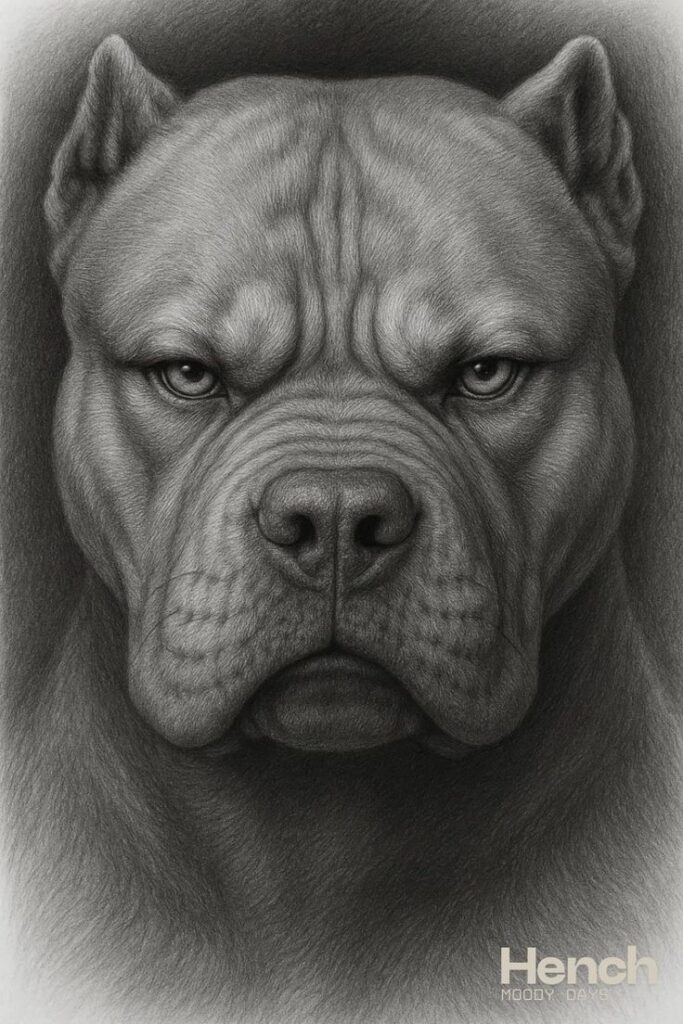
For our portraits we use smooth, heavyweight, acid-free drawing paper, chosen because it holds the fine detail that pet fur and facial features demand, takes many layers of graphite, and handles careful erasing for highlights. It also stays flat and robust enough to ship safely between boards.
Questions to ask an artist about paper
- Is the paper acid-free?
- What weight is it, roughly?
- Is the surface smooth or textured, and why did you choose it?
- Is the paper white or toned?
An artist who takes their materials seriously will have an easy answer to each. It’s a small detail that says a lot about how long your portrait will last and how carefully it was made.
In short
Good portrait paper is heavy enough to handle layering and erasing, smooth enough to hold fine detail, and acid-free so it stays white. When you look at a graphite drawing and see clean highlights, crisp whiskers and deep shadows with no shine or blotching, a lot of the credit goes to the sheet underneath.