Graphite and charcoal are both dark, dry drawing media, and people often use the words interchangeably. Put two portraits side by side, though, and the difference is obvious. One is silvery, precise and smooth; the other is velvety, bold and soft-edged. If you’re commissioning a black-and-white portrait, it’s worth knowing what each one does well.
What they’re made of
Graphite is a form of carbon with a layered crystal structure that slides off onto paper. Drawing pencils mix it with clay to make different hardness grades, from very hard H pencils to very soft B pencils.
Charcoal is made by burning wood (often willow or vine) without much oxygen, leaving almost pure carbon. It comes as natural sticks, compressed sticks bound with gum, and charcoal pencils, which are compressed charcoal in a wooden casing.
How they look
Graphite
- Ranges from pale silver-grey to a deep, dark grey
- Has a slight sheen, especially in heavily worked dark areas, which can reflect light at certain angles
- Holds a very sharp point, allowing hair-fine lines
- Blends smoothly into subtle gradients
Charcoal
- Reaches a true, matte, light-absorbing black that graphite can’t quite match
- Has almost no shine
- Works naturally in broad, soft, expressive marks
- Is harder to control for tiny detail, though charcoal pencils help
In short: graphite tends toward precision and subtlety; charcoal tends toward drama and atmosphere.
Which suits which subject?
Where graphite shines
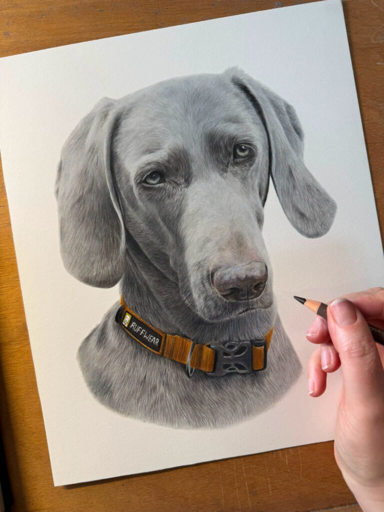
- Detailed pet portraits. Individual whiskers, fine fur texture and the glint in an eye are easier with a sharp graphite point.
- Light-coloured subjects. White dogs, blonde hair, pale skin and soft lighting all rely on delicate light-to-mid tones, which is graphite’s strength.
- Realistic likenesses. When accuracy of features is the priority, the control of a pencil helps.
- Smaller pieces. At A4 or A3, fine detail matters a lot.
Where charcoal shines
- High-contrast, dramatic lighting. A face emerging from a black background.
- Large-scale portraits, where broad tones cover big areas efficiently.
- Expressive, loose styles that celebrate gesture over detail.
- Very dark subjects where a deep matte black matters.
Combining the two
Some artists use both in one drawing, for example graphite for detailed features and charcoal for the deepest shadows or background. It can work beautifully, but it takes care: graphite’s slight waxiness can resist charcoal laid on top, so the order of layers matters. If you see a portrait described as “mixed graphite and charcoal”, that’s usually what’s going on.
Durability and care
Smudging
Both can smudge, but charcoal is much more powdery and fragile. A charcoal drawing can lose particles if it’s knocked, and it almost always needs a fixative spray and careful framing. Graphite is more stable on the surface, although soft grades can still smear if rubbed.
Light and time
Both graphite and charcoal are forms of carbon and are extremely lightfast. They don’t fade like many coloured pigments or dyes do. The paper is more vulnerable than the drawing material, so archival paper and sensible framing matter for both.
Framing
Both should be framed with a mat or spacers so the glass doesn’t touch the drawing. With charcoal this is even more important, because loose particles can transfer to the glass.
Paper choice
Graphite generally works best on smooth or lightly textured drawing paper, which holds fine detail. Charcoal usually needs more tooth, a rougher surface that grips the particles. Charcoal paper often has a visible laid or textured pattern that shows through in the drawing and becomes part of the look. Our post on paper types goes into more detail.
Why we work in graphite
At LogoArtX we draw in graphite pencil. Most of our commissions are pets and people where the customer’s top priority is a true likeness and fine detail: the exact pattern of a cat’s tabby markings, the texture of a grandfather’s beard, the curls of a child’s hair. Graphite gives us the control to build those details slowly, and it produces originals that are robust enough to ship and frame with confidence.
That said, charcoal is a wonderful medium, and if you love its bold, smoky look, it’s worth finding an artist who specialises in it.
Quick comparison
- Darkest black: charcoal
- Finest detail: graphite
- Subtle light tones: graphite
- Dramatic contrast: charcoal
- Surface durability: graphite
- Sheen: graphite has some; charcoal is matte
- Best for small detailed pet portraits: graphite
- Best for large expressive pieces: charcoal
Common misconceptions
“Charcoal is just darker pencil”
Not quite. Charcoal behaves differently on paper. It sits more loosely, blends into soft clouds of tone and lifts off easily with a kneaded eraser. That makes it great for sweeping light effects but less forgiving for tiny, exact shapes such as the edge of an eyelid or a single whisker.
“Graphite can’t look dramatic”
It can. A graphite portrait with a fully worked dark background and bright, untouched highlights can be every bit as striking as charcoal. It simply takes more layers, and the darkest areas may show a little sheen when light hits them at an angle.
“Charcoal drawings don’t last”
The charcoal itself is very stable. What makes charcoal drawings vulnerable is their loose surface. Once fixed and framed properly with a mat, they last very well.
How to decide
Look at your photo. If the things you love about it are small details, such as eyes, whiskers, freckles or the texture of fur, graphite is likely the better fit. If what moves you is the mood, the light and the shadows, charcoal might suit it. And if you’re still unsure, ask the artist to show you examples of similar subjects in their chosen medium. Seeing real work is the best way to choose.
Whichever you pick, both are timeless, hand-made and very different from a filtered photo. That’s the real point of commissioning a drawing.